[Advertisement – the chair, lamp, desk, paint and some accessories featured here were PR samples]

Today I’m sharing a look at the final part of our months-long first-floor renovation project: the small third bedroom / box room, which I use as my home office.
This isn’t really a big ‘reveal’, as this room has evolved gradually over the last few years and you’ll have seen glimpses of it in a few past posts, but I think that’s often the best way to approach interiors. Taking things slowly gives you time to drill down into what you like and don’t like, and craft a space that’s perfectly suited to you and your needs. It was particularly important here as this is where I spend most of my days, and I know from experience that I’m best able to focus in a tranquil environment. So, my aim was to create an office that’s calm and clutter-free, yet also cosy and inviting. Here’s what I did…
The colour
Choosing the right colour was key – especially as I have a condition called synaesthesia, which has a big impact on my daily life. You can read more about it here, but essentially it’s when one sense merges with another rather than being experienced separately. It can manifest itself in all sorts of different ways – some people perceive taste when they hear a sound, others might ‘smell’ touch – but in my case it means I see each letter, number and day of the week as a different colour. It’s totally involuntary and definitely has its upsides (it helps make editing text easier, and I have a very good memory for spellings, numbers and names etc), but it does mean my mind is constantly buzzing with colour. Having neutral walls acts as a bit of an antidote to that and stops me feeling sensory overload as I work.
For the last few years the room has been painted in ‘Cornforth White’ by Farrow & Ball – a versatile mid-grey that’s neither too warm nor too cool. I was very happy with it, and this is the only space upstairs where walls and doorways haven’t been moved, but the building work left it looking a little scruffy and so I took the opportunity to freshen it up with a slightly different shade. After testing out various options, I settled on ‘Matted Off’ from Crown Paints’ Elle Decoration collection. It’s still grey but it’s a bit paler than ‘Cornforth White’, with soft beige undertones; in some lights it also has a hint of green, giving a lovely connection with the natural world outside.


The flooring
Like the rest of the first floor, this room used to have the same tatty brown carpet that was here when we bought the house in 2014. We replaced it with oak flooring in the main and guest bedrooms, but that wasn’t really an option in here or on the stairs and landing due to lots of level changes and the bumpy remnants of an old stone hearth. So, we set about trying to find a nicer carpet and ordered lots of samples from Tapi – a nationwide company that was offering a handy home-visit service during lockdown. The ‘Cadiz’ ribbed carpet proved ideal and was just about do-able within our budget. It’s a very pale beige that makes the whole space seem so much brighter, and the subtle texture stops it from looking too monotone. It’s also designed for high-traffic areas so it should prove quite durable, although I’m going to have to be very careful not to spill anything on it!


The desk
My desk is from the Hair Pin Leg Company and I’ve had it a few years now. It’s just the right size, and I love its lightweight appearance and slim ply-edged top. The fact that it’s wipe-clean is also a big bonus, as it means I can quickly deal with any coffee stains or the muddy paw prints Loki the cat leaves behind when he climbs across it!
We used to have a single bed in this room to give us a bit of extra guest accommodation, meaning the only place I could put the desk was right in front of the window. But I ended up having to squint or close the blind to see my screen, so in the end we decided to get rid of the bed and replace it with a folding camp bed that we can bring out when needed. As a result I’ve been able to move the desk to the adjacent wall, reducing the glare issue but still making the most of the light. It’s also nice to be able to look out over the garden and the nearby trees every now and then, although the view is temporarily dominated by scaffolding as the building behind our house is being extended!
As my desk chair I’m using the blue-lacquered 70th-anniversary edition of Hans J. Wegner’s iconic CH24 ‘Wishbone’ chair, which was released by Carl Hansen & Søn for a limited period last year. I actually moved it up here as a temporary measure during lockdown, when Chris started working at the dining table downstairs, but I really like how it looks and I think it will stay in this room permanently. It’s comfy to sit on for long periods of time, and it adds a subtle splash of colour without overwhelming the space.


The shelves
Above the desk is a String Pocket shelving unit – a compact version of String Furniture’s iconic modular system, with shelves that you can position at whatever height you want. I use it to display a few favourite objects, including a raku-fired vase by Bristol-based ceramicist Reesha Zubair, a traditional wooden Saami kuska given to me after I went ice-swimming in Finnish Lapland and – most treasured of all – a photo of my grandparents looking wonderfully happy and care-free shortly after their wedding.


Storage
Good storage was essential, particularly as my desk has no drawers. I opted for a cabinet from IKEA’s modular ‘BESTÅ’ range, which you can customise with different fronts and legs (I chose white-stained oak-effect doors and white metal legs). It’s the perfect size for books, magazines and my big box of fabric, paint and flooring samples, and I like the fact I can add more shelves or extend it should I need to in the future.


Finishing touches
The rest of the room has been left purposefully clear, as it’s often where I set up still-life shots when doing photography and styling work; the airing cupboard is also in here, so we need space to open the doors! But I have used the walls and the top of the cupboard to display artworks that I find particularly inspiring, including an original painting by Kelly Jay, an expressive brush-work print by Melissa Selmin and a wonderful portrait of Loki by Taya de La Cruz, who forms drawings from tiny hand-written lettering. I also have a rotating selection of postcards, photos and sketches, which I stick to the wall with peel-off washi tape – almost like a pin board without the actual board!


I try to keep the surface of the desk fairly clear, so I don’t have much on there other than a lamp (the timeless ‘Miira’ design from Nuura), my current planner and notebook, and a few things to keep stationery and other bits and bobs organised. The textured ceramic pot is by Ferm Living and the white zig-zag-shaped pen stand is by Design Of, who use steel offcuts from the production of their minimalist furniture to make a range of smaller accessories such as this.
Last but not least, I have a few bits of greenery and foliage dotted here and there, as I find introducing natural elements makes any work environment feel so much healthier and more productive. These include a succulent houseplant in a minimalist By Lassen ‘Kubus’ pot, and grasses from the garden displayed in a Ferm Living shell vase and a beautiful hand-crafted display bowl by Tracy Dixon.


So, that’s my calming grey home office. I’m really pleased with it, and it’s a room I look forward to spending time in – always a plus! I’d love to know what you think, so please do let me know in the comments below. And if you want more inspiration on creating a work environment that suits you and your needs, you can find my tips on working from home here and see an example of a versatile and considered Copenhagen space here.
All photography by Abi Dare
 How to raise and save money when changing your home décor
  Interior Design Colour & Pattern Trends
  Injecting Personality into a New Build Home
  OUR DREAM LIVING ROOM MAKEOVER
 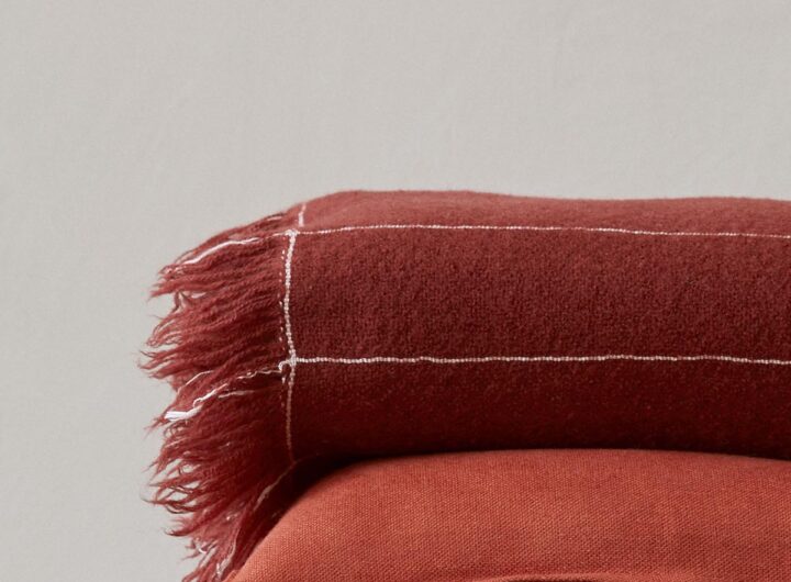 Loup & Co – Socially Conscious 100% Cashmere Throw
  Why You Need a Clutter-free Home
  The “Nervous System” Workday
  Magic: The Gathering – 4 Creatures Worth Buying
  Why exercise doesn’t have to mean pain