
I’ve always admired Swedish kitchen producer Nordiska Kök. All entirely bespoke, its designs mix a timeless Scandinavian aesthetic with beautiful materials and clever solutions for modern living. It’s just launched a brand-new concept showroom in Stockholm and I couldn’t resist sharing a few images – not only because the whole place looks absolutely stunning, but also because it provides plenty of ideas that might come in handy if you’re about to redo your own kitchen. So, read on for eight stylish and practical kitchen design tricks, illustrated with stunning examples from Nordiska Kök itself…
1. Sections of open shelving
If you like the idea of replacing wall-hung cabinets with open shelving but don’t want to compromise on storage, how about mixing the two? The upper cupboards in this kitchen have open sections dotted among the doors – ideal if you want to keep a few favourite items on display while hiding other things away. The overall look is very effective, and it helps to break up a large bank of units that might otherwise overwhelm the space. You can opt for contrasting materials, as shown here, or stick with the same for a more streamlined aesthetic.

2. Tone-on-tone palettes
Apart from the stained-oak shelving sections, this kitchen is designed with a pale tone-on-tone palette. Using harmonious colours and materials in this way creates a calm, airy feel and makes the space seem bigger than it is, as one element seems to merge with the next. Importantly, though, there’s just enough variation to keep things interesting, with mushroom-grey units giving way to mottled limestone worktops and gently textured walls.

3. Different unit colours
If tone-on-tone decorating isn’t your thing, you could mix unit colours for a striking effect. The easiest option is to pair lighter and darker shades of the same hue, but two entirely different colours can work equally well – just make sure they share similar undertones, like the muted olive green and stone grey here, to avoid a jarring clash. Putting the darker shade on the bottom cabinets and the lighter one on the top will enhance the sense of height and space, but you could also use different colours to accentuate an island unit or tall pantry-style cupboards.

4. Fluted glass
Fluted glass doors add a note of timeless elegance to a kitchen, providing an interesting twist without overwhelming an otherwise understated scheme. The textured glass gives a lovely hint of what’s inside the cupboards while obscuring the contents enough that you don’t have to worry about keeping everything pristine. What’s more, they work with lots of different styles – here they’re shown with classic Shaker-style units, but they look just as good in sleek contemporary schemes.

5. Split-level island units
Adding a lower level to your island unit or kitchen peninsula creates an inviting dining area, meaning you can use standard chairs rather than high bar stools. It’s much more comfortable if you plan to sit there for full meals rather than a quick cuppa, and it’s a great option if you have small kids clambering around. You could even use the same trick to form an integrated bench seat and top it with cushions.

6. Dark-stained wood
Rich, dark-stained wood can add warmth and texture to kitchens, making them feel luxurious and sophisticated rather than utilitarian. It looks particularly stunning when offset with pale stone worktops or metals such as brass, and good kitchen suppliers like Nordiska Kök will select and cut the timber in a way that showcases the grain. If you’re worried dark wood will overpower the space as a whole then keep it to the lower units only, or use it to pick out specific sections and opt for something lighter elsewhere.

7. Grid patterns
Cupboard and drawer fronts with raised-profile edges make a wonderful alternative to completely flat ones, allowing you to create interest through grid-like patterns while maintaining a minimalist effect. The resulting look has a hint of traditional cabinetry about it, and it gives things a lovely tactile feel. Keeping things handleless enhances the clean lines even further.

8. Wooden wall panelling
Finally, slatted wooden panelling is incredibly popular right now, and it’s just as do-able in the kitchen as it is in other rooms of the home. You could use it with contrasting units to create a statement feature, or run it behind matching ones for a seamless, harmonious look. Just make sure you choose panelling that’s suitable for the warm, humid environment and avoid putting it directly behind the sink or hob.

See more beautiful kitchens from Nordiska Kök and find out how its bespoke design process works here.
All images courtesy of Nordiska Kök. Styling by Marie Graunbøl; photography by Andrea Papini
 How to raise and save money when changing your home décor
  Interior Design Colour & Pattern Trends
  Injecting Personality into a New Build Home
  OUR DREAM LIVING ROOM MAKEOVER
 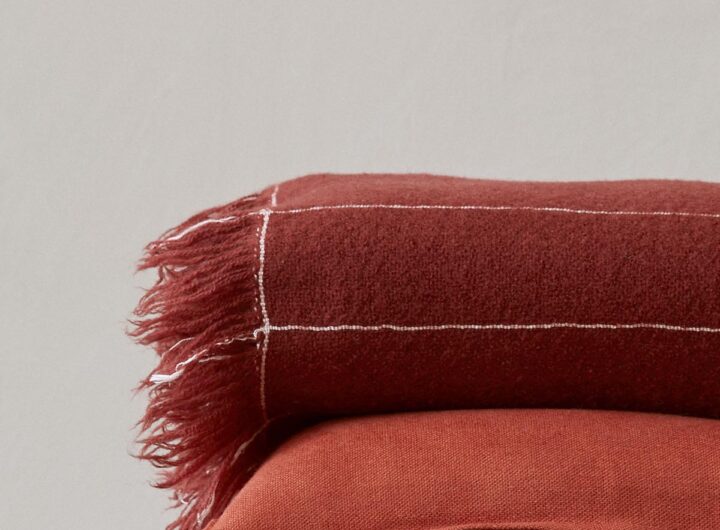 Loup & Co – Socially Conscious 100% Cashmere Throw
  Why You Need a Clutter-free Home
  Magic: The Gathering – 4 Creatures Worth Buying
  Why exercise doesn’t have to mean pain
  5 Tips on How to Train Your Brain