
I’m starting the week with some inspiration from Danish kitchen-design studio Nicolaj Bo. They’ve just completed the open-plan kitchen and dining area of a Copenhagen family home, and it’s a great example of how minimalist decor can be warm, welcoming and very practical to live with.
The house in question sits in Kartoffelrækkerne, a picturesque neighbourhood originally built in the 19th century to provide accommodation for labourers. It’s arranged over three levels and each floor has a relatively small footprint, so making the best use of the available space was key. The owners therefore decided to change their original plan of installing a kitchen based around IKEA’s standard ‘METOD’ system, instead opting for a custom-built solution created specifically for the room’s shape and dimensions.
The resulting design not only looks beautiful, it’s full of clever tricks that maximise every square centimetre. Ceiling-height cabinets wrap around an internal corner, incorporating the radiator to give as much storage as possible, while an island unit creates additional cupboard and worktop space without blocking light from the tall windows. There’s also an open niche, providing a handy spot for the coffee maker and other utensils, as well as display shelves that break up the bank of units. On the other side of the room, a bespoke table and built-in bench form an inviting dining area, with enough room for family meals and more storage hidden beneath a lift-up seat.


The choice of colours and materials also helps to maintain the spacious and airy feel. The cupboard doors are covered in mushroom-grey linoleum – a durable, easy-to-clean option that works brilliantly in kitchens – and they harmonise seamlessly with light Jura stone worktops. Wooden elements, a suede seat cushion and a rattan radiator cover provide a striking yet sophisticated contrast and gently warm the pale, muted scheme.


Although the overall look is simple and clean-lined, there are lots of beautiful details that reveal themselves as you look more closely: visible mortise joints on the drawers, fossils in the worktop, an elegant gap between the two planks that make up the table. The lighting has been cleverly thought out, too, with recessed LED spotlights in the niche and a sleek bar-shaped pendant over the dining area.


Nicolaj Bo also designed the house’s bathroom, using the same materials to create a cohesive feel. Here, linoleum has been incorporated into the vanity unit, and Jura stone features in the wall and floor tiles. The oak mirror frame, meanwhile, echoes the wooden finishes in the kitchen.


All images via Nicolaj Bo
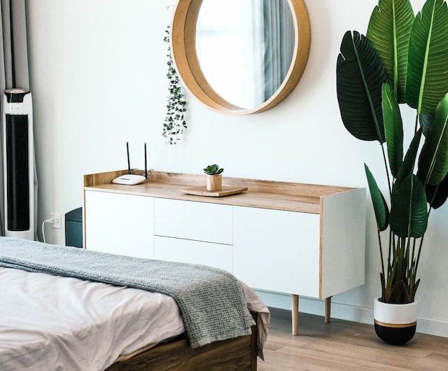 How to raise and save money when changing your home décor
  Interior Design Colour & Pattern Trends
  Injecting Personality into a New Build Home
 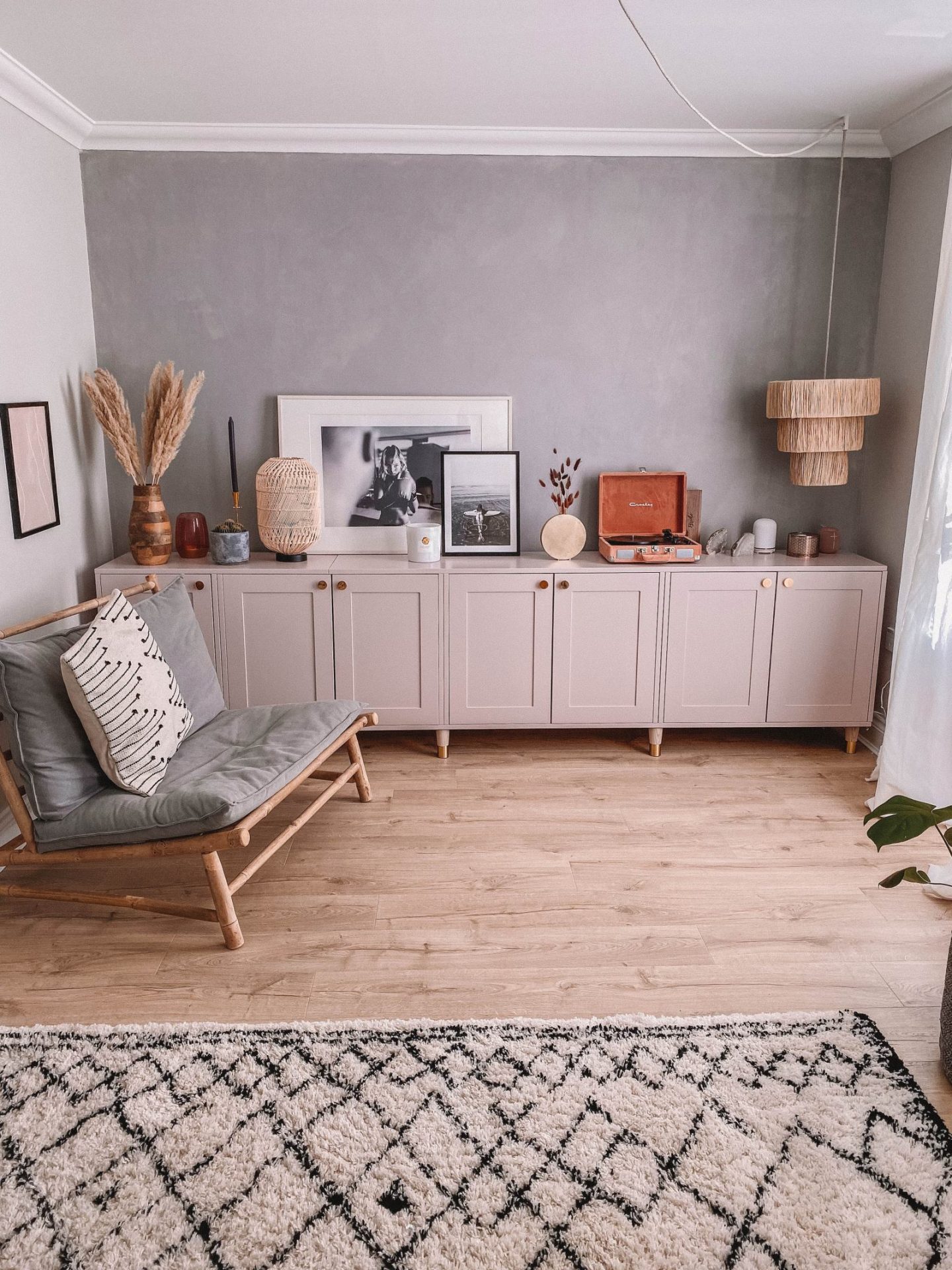 OUR DREAM LIVING ROOM MAKEOVER
 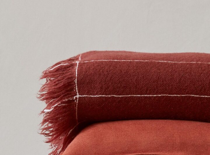 Loup & Co – Socially Conscious 100% Cashmere Throw
  Why You Need a Clutter-free Home
  The “Nervous System” Workday
  Magic: The Gathering – 4 Creatures Worth Buying
  Why exercise doesn’t have to mean pain