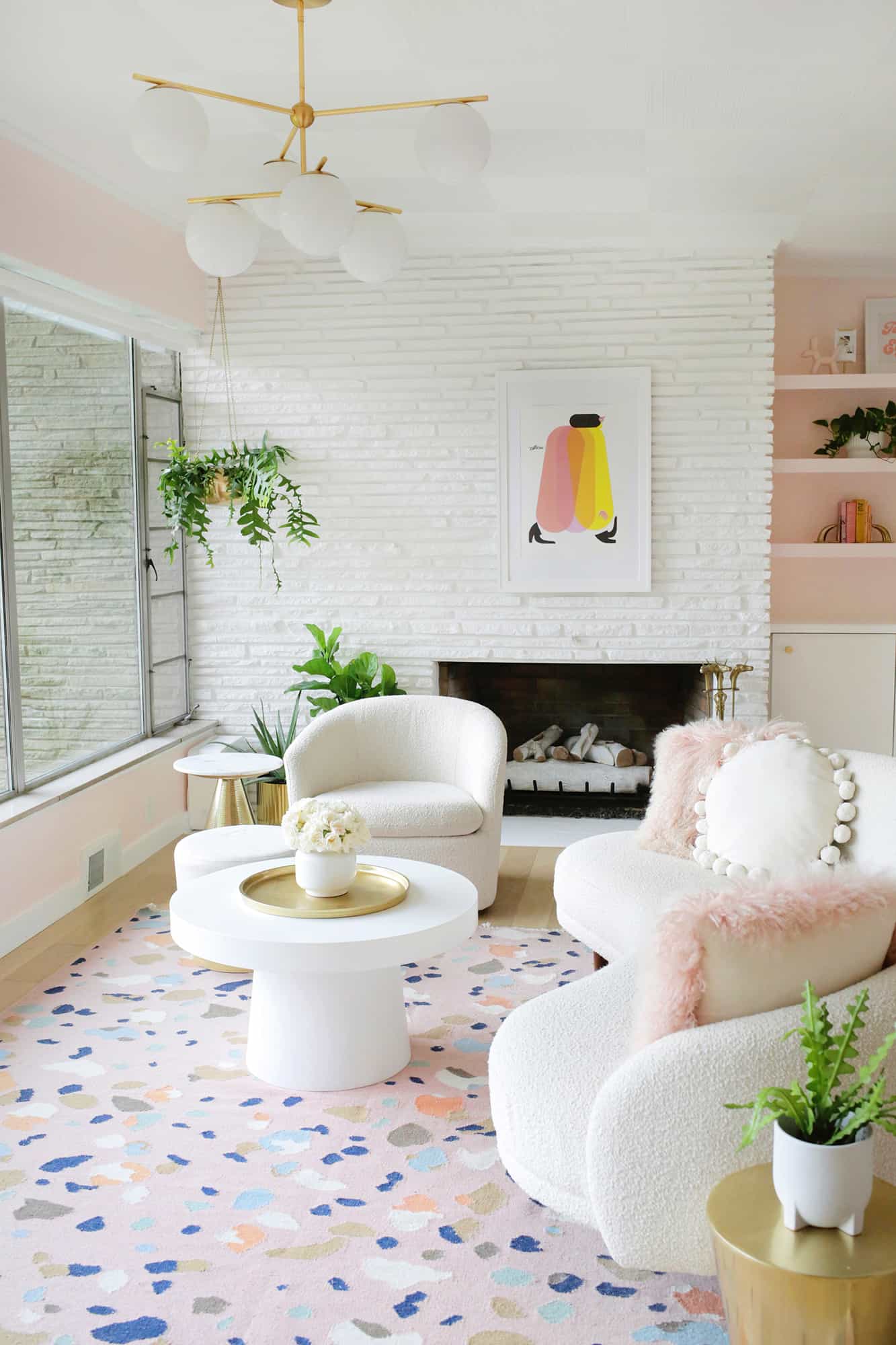
We are rolling right along with room tours from the mid-century home we’ve been working on for the past year, and today’s tour is the living room! Like most of you (I bet), we spend a large percentage of our time in the living room. It has our TV, fireplace, and is set up to be the centrally located hub of the house, as well.
This room was not a quick fix by any means as we had to do some major ceiling repair on the vintage combed ceiling panels, fully replace a crumbling tile floor (sharp edges and loose chunks of grout were everywhere), add built-in shelves and make over an old fireplace.
But, I have to say that the end result brings a lot of light and joy to the home and helps feature the huge windows that helped us fall in love with the house in the first place (see the before and after photos below for the transformation!).
I really wanted the whole house to flow in a specific warm color palette with some elements (you can see my home mood board and plans here). So I tried to pick some elements and shapes that would give off a ’70s retro vibe in a modern and trendy (and pink!) way.
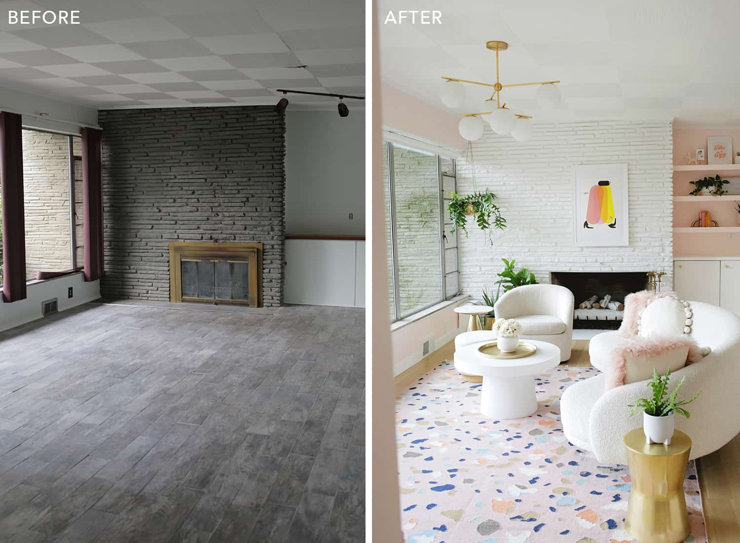
As you can see, the dark floors and fireplace in the “before” are a big contrast to the brighter “after” photo. We also took off the front of the old wood-burning fireplace and had a gas log fireplace installed instead. We love it!!
A fireside hang is one of my favorite things in life (and all through winter).
The biggest change in this room is definitely the floor, though. We had a huge issue with the previous tile floor coming up off the subfloor to where it was cracking and breaking all over the place (due to poor installation) and there were piles (not exaggerating!) of loose grout chunks all over the place.
We had to wear slippers or shoes for the first nine months of living there so your feet weren’t grey with grout dust or cut by a broken tile edge—fun!! The white oak flooring was a very long ordeal to get done correctly, but we love how it came out! It felt like such a treat to walk around in bare feet, haha …
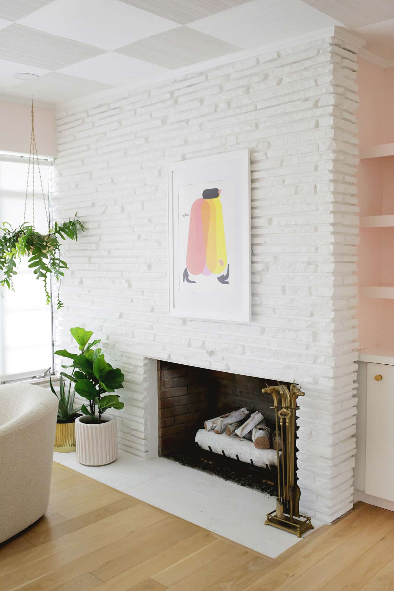
My husband affectionally calls this art print “hot dog girl,” but I love the artist and have several of her pieces throughout the house. I know some people are not for painting stone, and that’s OK, but I really love how the painted stone lets you see the nooks and crannies of the texture even better than when it was all a dark color.
We added a vented gas log set (with these birch logs in the 30″ size) and converted the fireplace to gas instead of wood burning—it’s for sure the best spot in the house once winter rolls around. We like to pull over the coffee table and do puzzles with Lola in front of it at night.
Enjoying this room tour before + after? Check out my …
I like to have at least one hanging plant in most spaces when I can, and you can’t go wrong with a simple brass planter. Those fishbone cactus plants are one of my favorites for hanging planters, and they are pretty easy to keep alive (so that’s a plus for me).
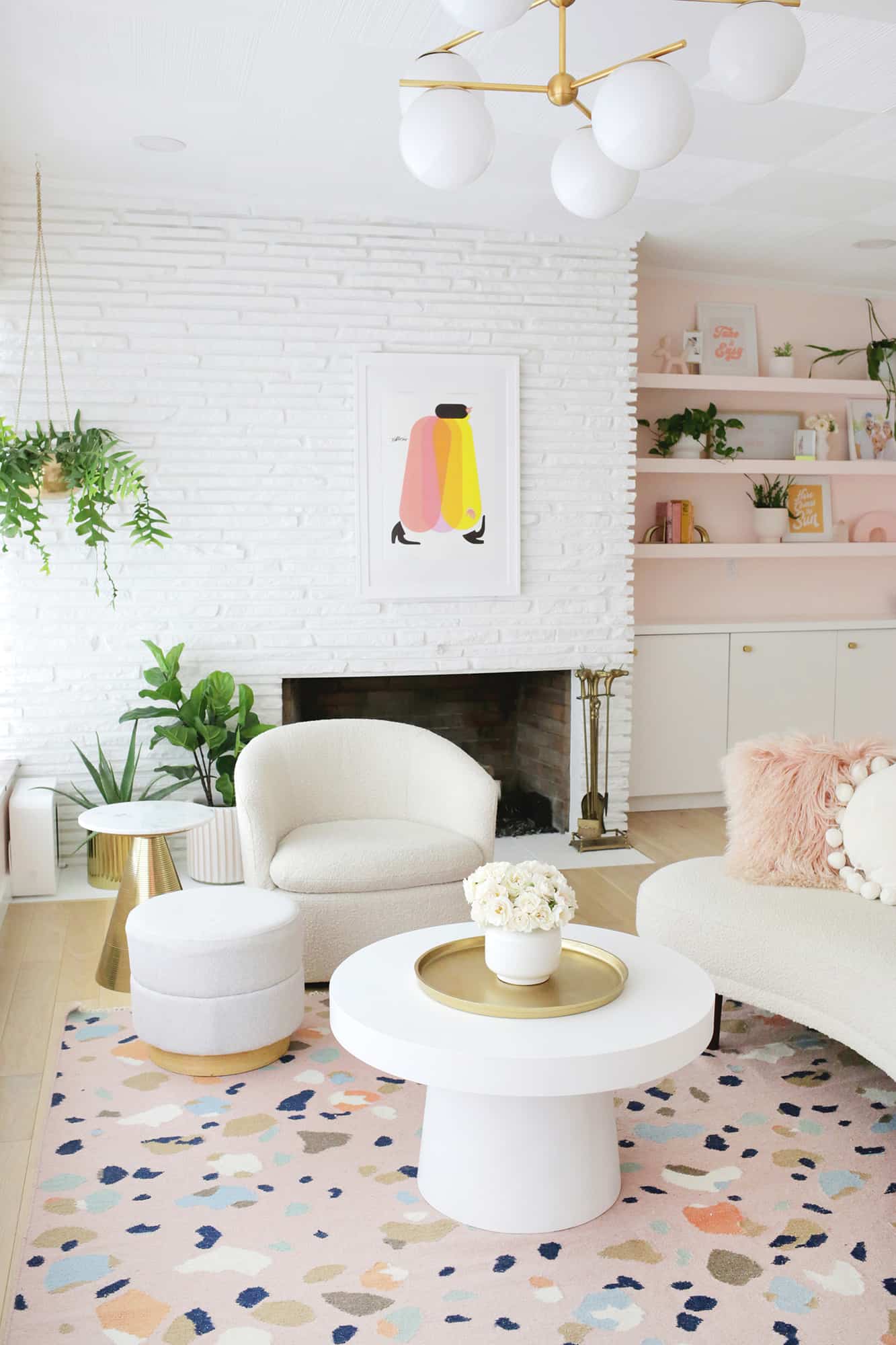
I really wanted a cozy fireside chair, and this Turoy swivel chair is basically perfection for the upscale vintage vibe I was going for. The swivel part gets used a lot to turn back and forth from TV watching to fire gazing (and our cats love to sleep on it, too).
Boucle fabric is also kiiiind of an obsession for me and I love the cozy texture it adds.
I had the hardest time finding a rug I liked for our living room until I found this pink terrazzo rug. It adds color, print, and visual texture and it’s super easy to vacuum, as well.
That mushroom coffee table (similar here) and gold cone side table (similar here) also adds to the ’70s vibes, and I love them.
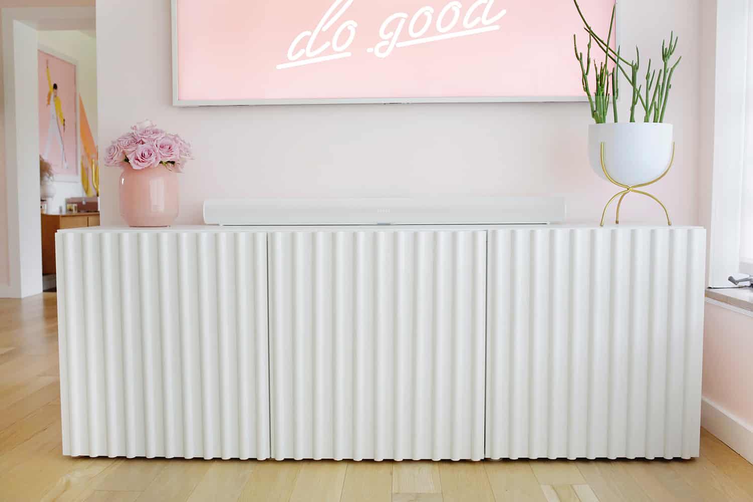
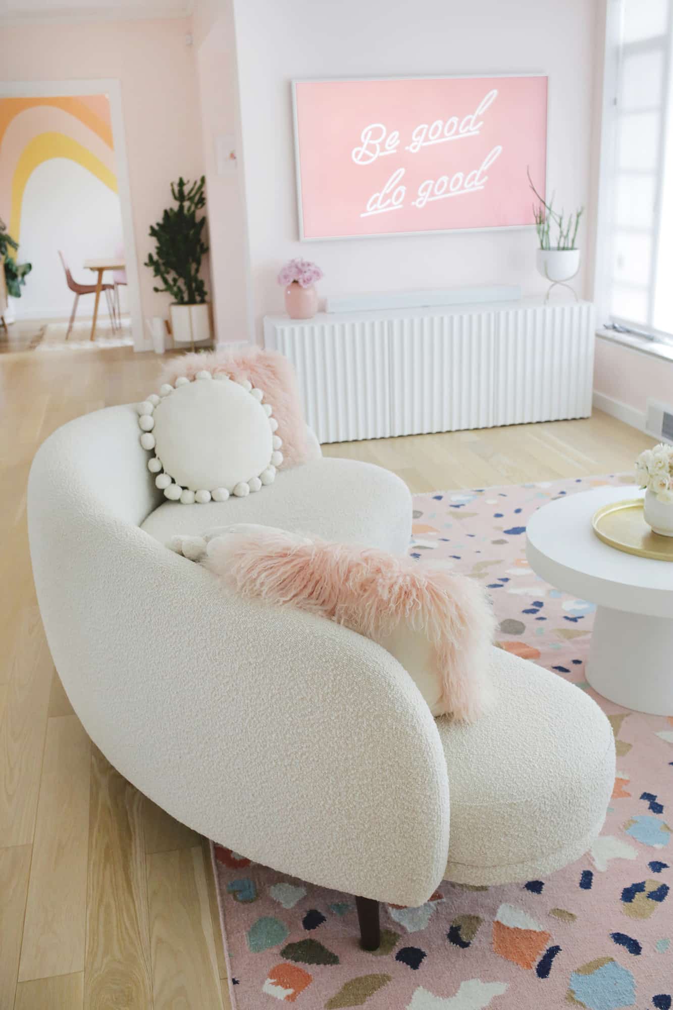
There was a $1,000 fluted credenza I was eyeing last year, but I just couldn’t bring myself to spend that (plus shipping) on the item, so I did this IKEA hack on a Besta sideboard, and I’m SO happy with how it turned out!
I think it’s one of the best looking DIYs I’ve done—you really can’t tell that the fluting was added on and it looks luxe for less. Here’s a smaller cabinet if you like that fluted look.
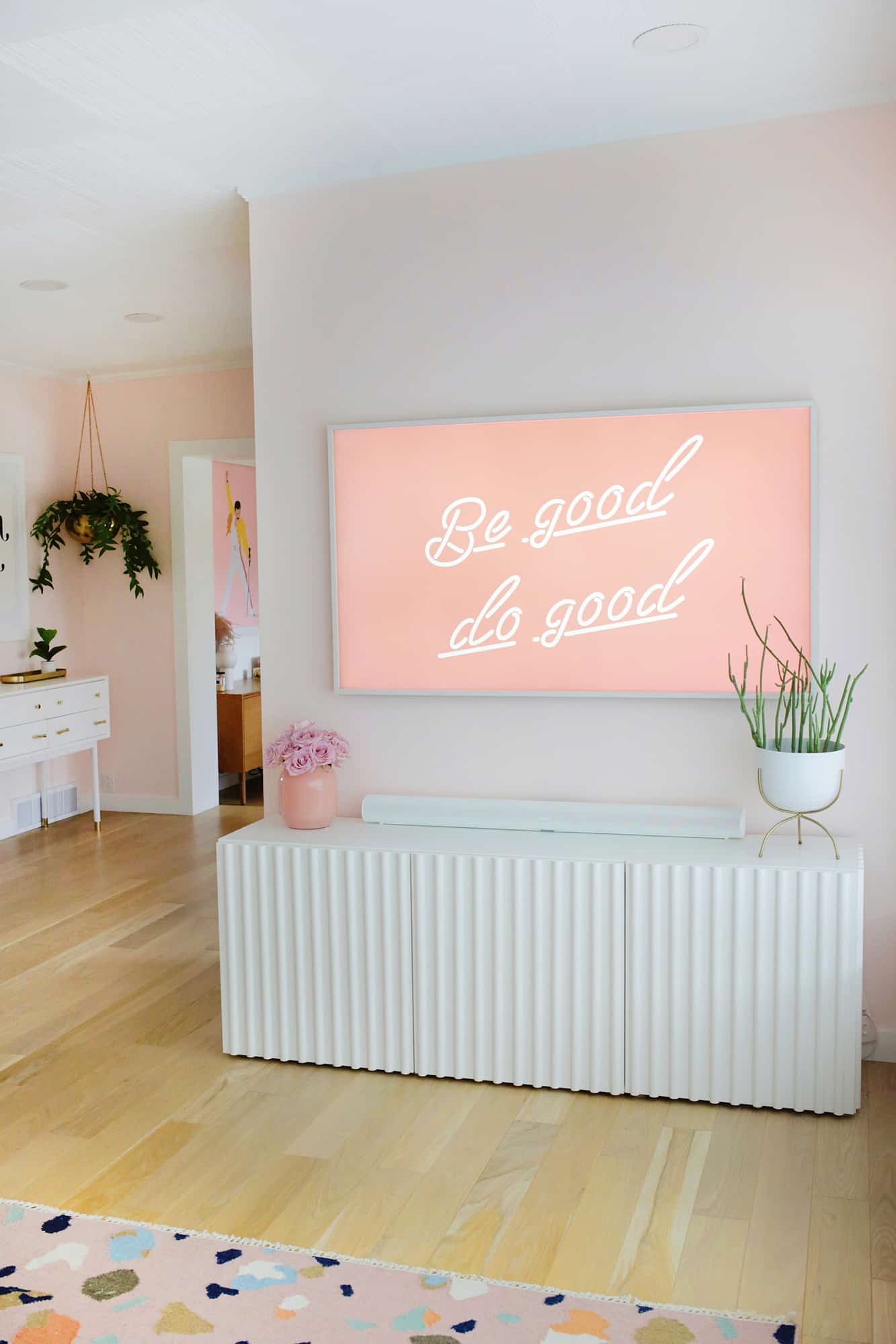
Just a little shoutout to our Frame TV. If you haven’t seen those, I’ve been eyeing them for a few years as I love how they look just like a framed piece of art on the wall when not in use. When our TV started losing rows of pixels last year, we decided to go for the Frame (with a white frame option) and I’m so glad we did.
I can put family photos, seasonal art, or digital art from Etsy up on the screen in a flash, and it feels like just another print on the wall rather than sticking out in an obnoxious way.
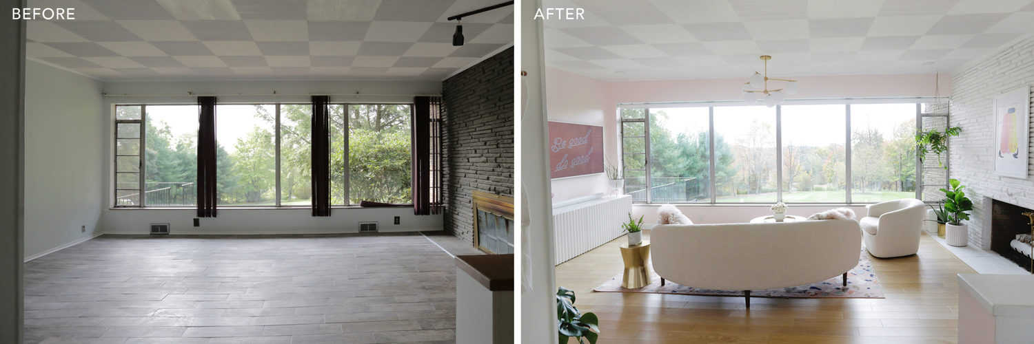
How good are those windows?? So good. We took out a bunch of overgrown bushes that were covering up half the view, so now you can see all the seasons and magical snowstorms in a more panoramic view.
We installed some light filtering roller shades over the windows since the sun comes in that side of the house during the winter, and makes it hard to watch TV during the day. It also helps the room not get as hot with the shades down in the summer.
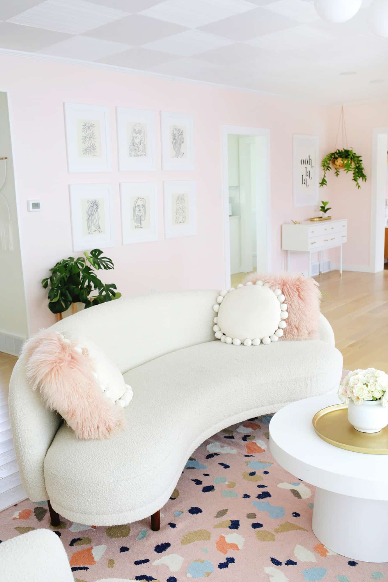
I’m not always a matchy-matchy person with furniture, but I actually love having a boucle chair and the same fabric for our curved Kayra sofa, as well. The curved sofa is such a fun piece to have as one of the main things in the home, and it really brings the retro factor up a notch while the boucle fabric keeps it modern.
And if you’re curious about having pets and a toddler with white furniture, I hear you! I do think about that stuff when I choose home decor, but I also tend to do what I want and just deal with life as it happens.
We’ve had lots of occasions to spot clean the furniture but I’ve gotten to them quickly, and so far everything still looks great! Not for everyone, but it works for me 🙂
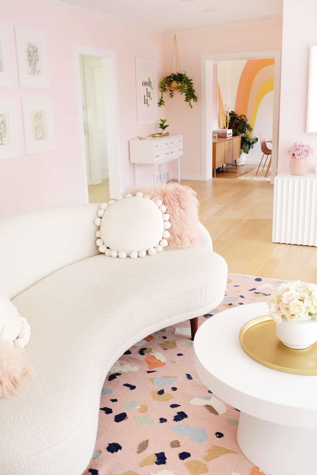
Love those round pom-pom pillows—so fun and they are a nice solid contrast to my fluffy pink pillows as well.
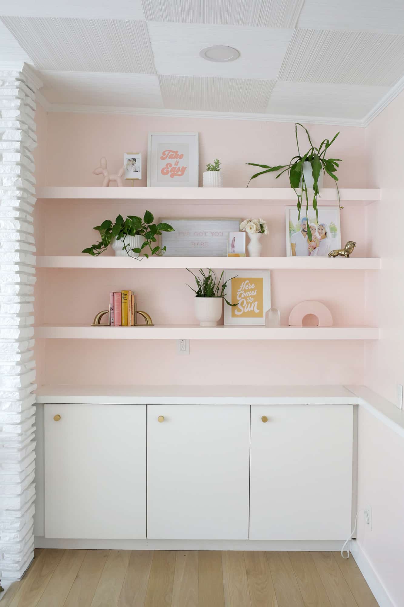
I made those built-in shelves last fall, and while we may change up that area a bit if we ever add a mantle to the fireplace (which I would like to), I love having the shelves for holiday decor and adding some greenery to that wall.
We also had the flimsy storage area at the bottom rebuilt to be three cabinets, so we have a great spot for books and toys that we want to keep near but out of sight when the room is tidy (which is sometimes but not always, haha).
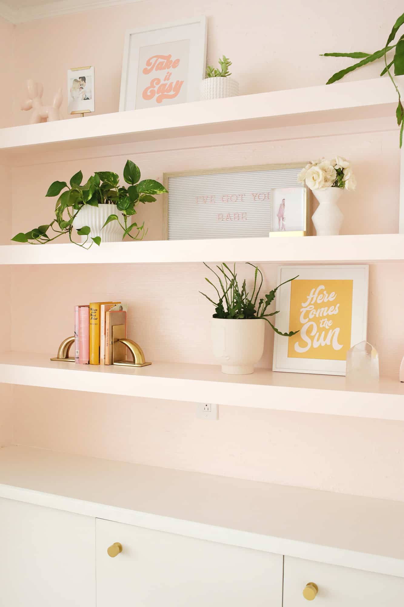
For shelf decor, items like letter boards, cool bookends, vintage/pretty colored books, prints (here’s the “take it easy” and “here comes the sun” prints) and family photos, and plants are usually my staples (these small fluted planters are great).
I also like to add a few unique finds like vintage trinkets and whatnot (that big clear crystal is a vintage find from a decade ago that I still like a lot).
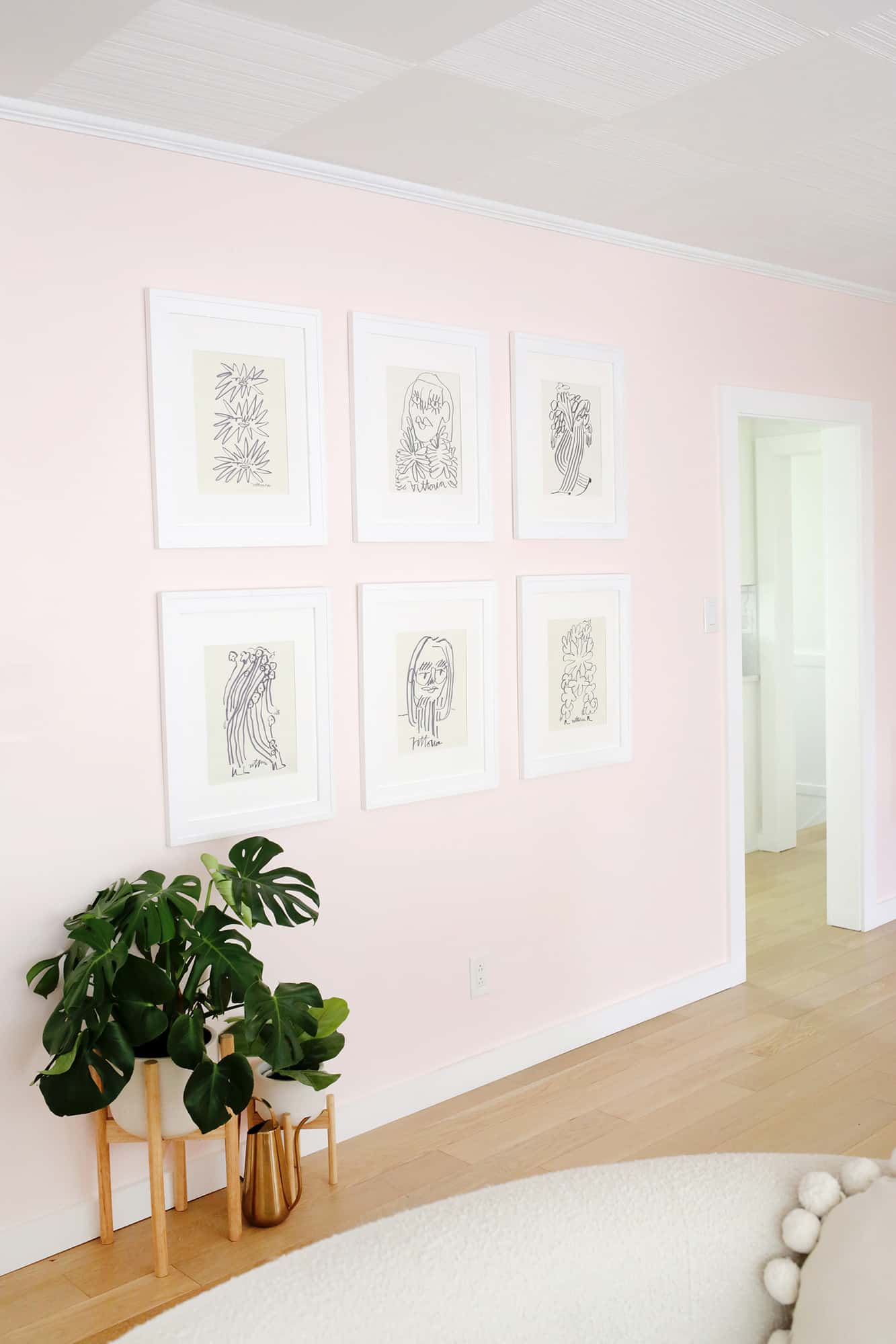
I adore the Sketch restaurant in London that’s all over the internet with their velvet pink booths, and I wanted to make a mini version of their gallery walls (that are just fun black and white line drawings) to create an easy black and white gallery wall DIY.
I chose these prints for my wall (1 / 2 / 3 / 4 / 5 / 6), but I really want to get three more and make it a set of nine sometime next year.
Check out this post to create your own Easy Black and White Gallery Wall!
I’m a sucker for a good globe light fixture and this one is great since it’s the perfect mix of vintage and modern.
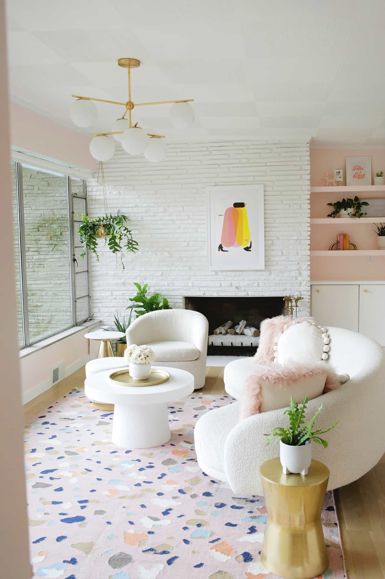
Overall, this room feels so bright and happy now that we’ve refreshed the space in a major way. We also have plans to paint the outside so the fireplace portion on the exterior of the house will match the inside.
You’ll have that indoor/outdoor feel again that you get seeing both through the big glass windows (a very Frank Lloyd Wright-ish kind of thing that I love).
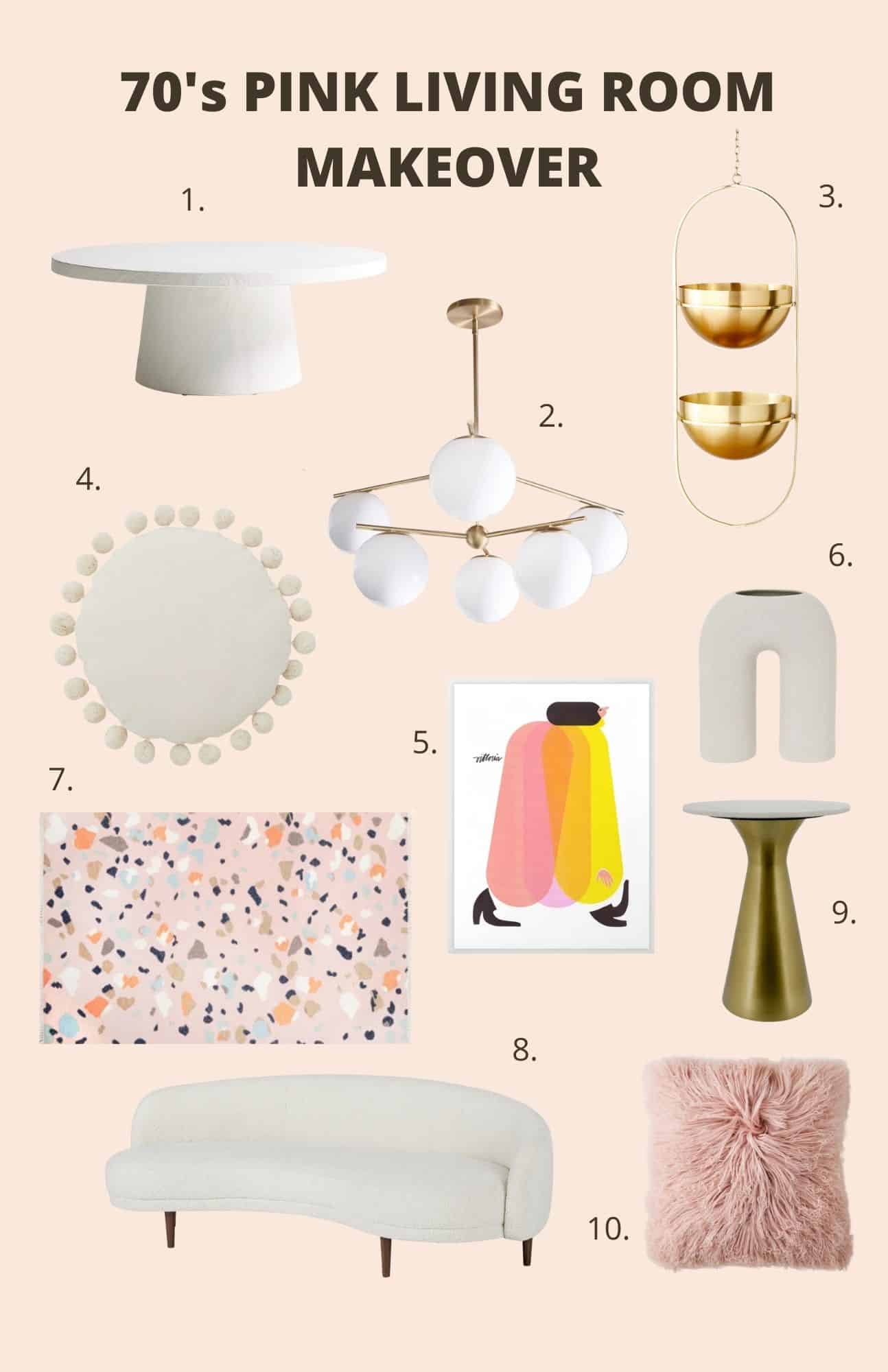
Feeling cozy in your home can be so important, and I love that this room gives us a place to relax and enjoy each other throughout the day.
Since this area hadn’t been renovated yet last holiday season, I can’t wait to put up our tree and all my decorations to make the room as magical as I possibly can. What do you think, does it feel happy and inviting to you?! xo. Laura
Credits // Author and Photography: Laura Gummerman.
 The 15-Minute Movement Habit -Simple Desk Exercises for Working Bloggers
  How To Become A More Mindful Person
  How To Beat Loneliness In London
  Free green spaces to enjoy just outside of London
  How To Store Bicycles In Self Storage
  Why 2026’s top bloggers are going back to paper planners to spark creativity
  Why exercise doesn’t have to mean pain
  5 Tips on How to Train Your Brain